Starting with the church logo design in 2018, Kishan Doshi began his journey as a brand designer, and the client loved it immediately. Today, Kishan supports over 300+ clients from 15 countries and many celebrities. Coming from India, Kishan has partnered with multiple international brands and now opens a studio in Atlanta. He collaborated with King Joel (co-founder and lead designer) and named their business Kishvi Studio.
Being a brand designer is incredible but could sometimes make Kishan feel overwhelmed. He loves challenging tasks and likes to create out-of-the-box concepts for brand identities. At the same time, Kishan always adds his touches to the client’s requirements for a unique vision for their businesses.
Do you believe graphic designers can impact society with their works? What would be your strengths and weaknesses?
Yes, I do. Simple designs shape this complicated world. It has a significant impact on our society and culture. Designs provoke emotions. In thousands of years of human evolution, one thing is common to see—designs—for example, the hieroglyphic designs of Egypt. The pictures visualized their rituals and what they did. They created body figure designs to make us understand what their culture was.
My strength is that I see designs in everything, whether it’s an animal face structure or a vast universe that consists of spiral or elliptical galaxies. I’m so obsessed with designing that I keep working on it until it’s done, but I should do more when it’s done. Honestly, I don’t know if it’s a weakness.
What qualities, skills, and design app packages should a modern graphic designer have?
Innovation happens all the time, and it drastically eases up the process of designing. And designers should always keep themselves up to date. People are looking for complete packages and prefer to stick to one source instead of looking for different sources for different missions. So, for example, I produce designs, brand development, product designs, product strategy, and market strategies. So I started with the logo but soon realized that people need these things too for their new brands or re-branding. In short, they should use all the software they can and utilize it for better results. So I want to point out that whatever you do, sharpen your “showcase” skills. So the more creative you get with your work showcase, the more successful you will get.
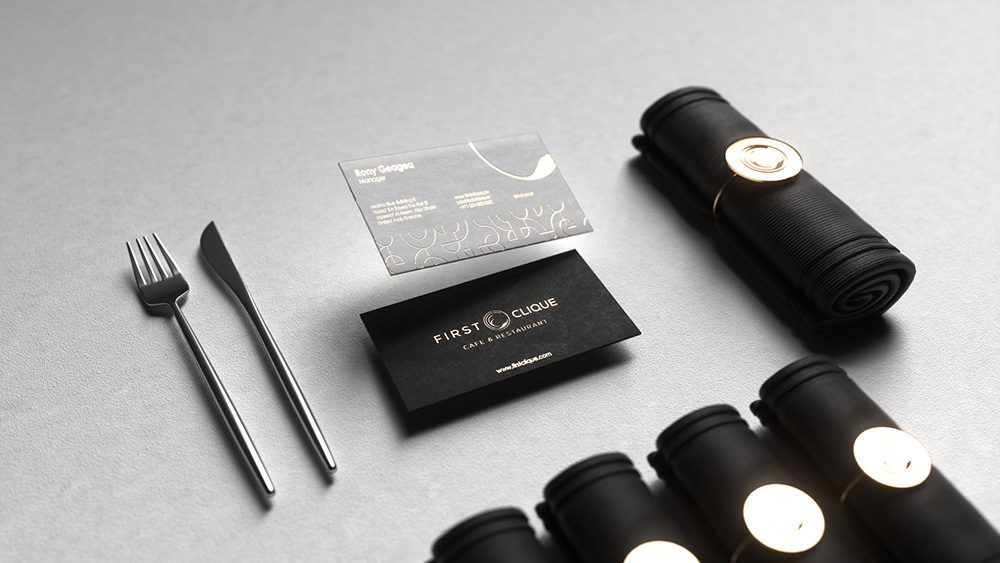
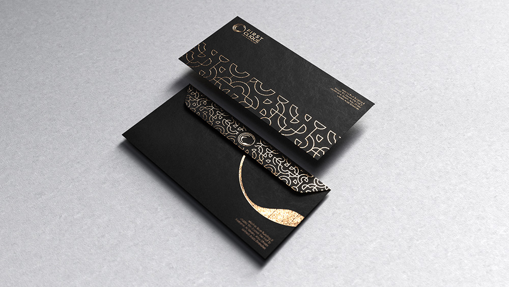
You’ve worked with top-tier clients, theatres in New York, and upscale restaurants in Dubai, to name a few. So how do you incorporate clients’ vision and feedback into designs?
Frankly, those are some of my crown jewels. I love the outcome and feel great about how those companies are doing now. I gathered a lot of data from clients, and I researched their social presence for the whole week, how they were interacting with their audience and what I could do to get more attention for the brand. I usually use the ratio “50% client, 50% me”. I am analyzing data from clients, seeing what they want and how they want to do it at first. And after that, I add my touch to the design, so it stands out from whatever is currently on the market. So I show them the sketch of what looks best with additional options. And if they have feedback, I will usually complete everything we discussed during meetings so it would be a quick edit, and they can see the progress simultaneously.
How comfortable are you with short deadlines and new design trends in a fast-paced environment?
It’s usually a 3-week work since I constantly research before starting initial sketches. I’m not too comfortable with short deadlines; however, it depends on the client. If they have some preconceived ideas, it can shorten my work timeline. But usually, my clients grant me the creative freedom to add my touches to the final concept, and that’s why it takes a bit of time. Good things take time. Period.
Speaking of trends, I’ve always believed that a concept should be timeless. The Apple logo was released in 1977, almost 40 years ago. And the logo is still one of the most iconic in the world. It has some color variations, but the core Apple logo is the bitten apple forever. Likewise, I feel like a logo should work in black and white first and then can be manipulated in 3D and gradients. Also, remember, it should be simple.
At Kishvi Studio, do you work better alone or in a team? What is the significance of communication in graphic design?
A team can be helpful, but I prefer working alone, so I don’t have to rely on or wait for someone to do the job. Also, too many heads create confusion. I am better off alone.
It is essential and is considered a must-have skill to express yourself. Sometimes, it will not be adequately conveyed when you explain something and sound rude, even if your solution is excellent. And the situation can go downhill from that point. Communicating correctly and calmly in an understanding way is necessary for designing since you have to convey a message not only to your client but also to their targeted audience.
Please walk us through the designs you are most proud of and describe the process involved.
The following are some of the designs that I like—my pride and joy:
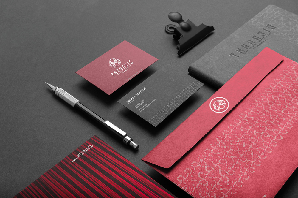
1. Logo Design for Thanasis Theatre LLC (Theatre Company, Unites States)
The idea behind this logo was to create a simple yet creative identity representing the brand. I used two lions which meant the client’s zodiac sign Leo (Leo’s two lions) and incorporated it with an infinity sign. It took me one and half weeks to do this research and two weeks to create the sketches. Overall, completing the brand identity project took three and a half weeks.
2. Logo Design for Kyron (Yacht Designer, Unites States)
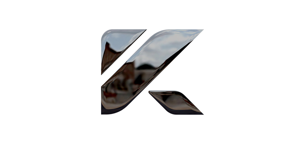
This one was very challenging because the client was very keen on what they wanted. The Tesla logo inspired them very much, and they wanted something similar. Modern and futuristic. I created an abstract stand-alone ‘K’ mark for their brand name. The 3-bar design of ‘K’ represents a sleek design. The subtle round corners represent endurance, just like the modern yachts are. Overall, the client was thrilled with this one. Fun fact: It took me one month for this project, and I created almost six concepts for them, and the finalized one can be seen below.
3. Logo Design for Legendury Beatz (Singers and Director, United States)
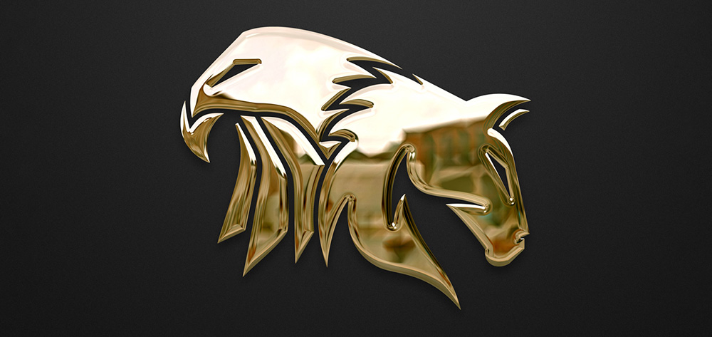
Two brothers that are singers wanted a logo for their brand. They reached out to me with only two requirements: an eagle and a horse for the logo. Everything else depended on me. I could practically do whatever I wanted for their logo and was granted creative freedom. Instead of giving both (Eagle and Horse) different logos, why not just fuse them? It took me almost three weeks to the first sketch. The eagle has sharp eyes, and the horse is head down to earth (emotion). One thing the client loved about this concept, which was also an accidental case since it was not intended, is that the top part of the logo is the shape of Africa which is also their homeland. So they immediately told me to work on it, and it came out fantastic.
4. Logo Design for Liqa (Smart Bottle Brand, Germany)
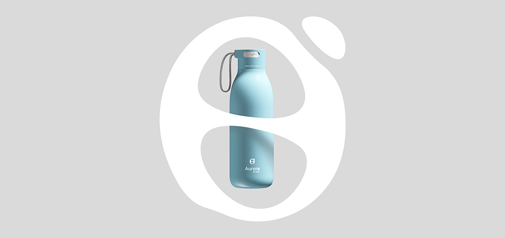
This logo is my most lengthy project to date. I worked on it for almost two months. The project had the most ups and downs with my workflow that I ever had in my career. The final logo was rejected, but then they saw what I had envisioned for their brand and understood it. It contains various elements: degree, theta symbol, and a water drop. I was working on this project and saw a water drop on my desk, giving me an idea for the theta symbol. That’s why I chose it. The icon itself contributes to the process of branding products – water cleansing power. They loved it and finalized it with several revisions.
